#iSoc12 Take a look inside the design!
 This is the final logo for our App. The key hole refers to a kind of curious voyeurism. The user peeks virtually through the keyhole of different buildings throughout Ghent.
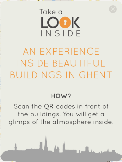
When you open the app the first thing you’ll see is this pop-up screen with a little introduction. you can always go back to this page with the question mark-button (see last image).

Next thing you’ll need is a navigationbar. I’m not quit sure wich one is the best, all feedback is welcome. The left button is used to navigate to home and the right button to go to the map. The one in the middle will get you to the scanner.


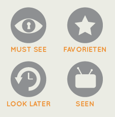
Below you find the four buttons on the homescreen.

MUST SEE: buildings you must see based on the favorites of all the users.
FAVORIETEN: buildings you have marked with must see.
LOOK LATER: buildings you scanned but didn’t watch the video from.
SEEN: All the buildings you’ve scanned and seen the video from.

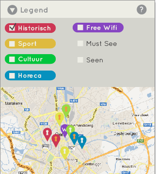
Above you can see the map-page. When you slide open the legend, you can see which color stands for which category. You’ll be able to check or uncheck the categories you want to view on the map.
I hope this will give you some more visualisation of our app, and again, all feedback is welcome!
This post was also published on Apps For Ghent.

